Monday, November 21, 2011
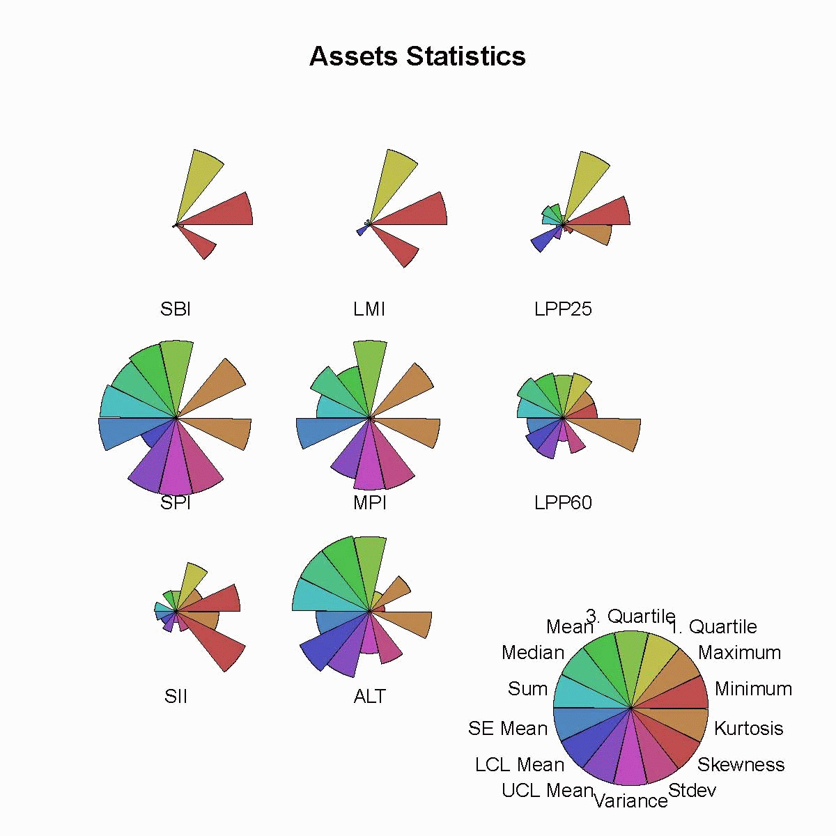
Star Plots
Star plots are an extremely useful way to display multiple observations observations with an arbitrary number of variables. Each observation is represented as a star-shaped figure with one ray for each variable. For each observation the length of each ray is made proportional to the size of its corresponding variable. With star plots variables are used to construct the plotted star figure. The data or star-shaped figures are usually arranged in a rectangular formation.
 Link: https://www.rmetrics.org/node/35
Stem and leaf plot
The stem and leaf plot is used to represent statistical data in two columns. The numbers on the left represent the the stem and the numbers on the right are the leaves. This plot represents quantitative data in a graphical format. These quickly relate the range and distribution of the data to the reader. The stem is representative of the ones place while the leaf represents the rest of the number.
 Link: http://psych.rice.edu/notestat/chapter2/stem.html
Box plot
Box plots are used to display a 5 number data summary. The upper limits of the box contain the 75th percentile while the lower limits of the box contain the 25th percentile. The middle of the box contains the 50th percentile. With in the box plot is the median, the upper and lower quartiles and the minimum and maximum data values. The line in the middle of the box shows the median values while the outer lines show the minimum and maximum values.
 Link: http://dominiquegrant.blogspot.com/2009/01/box-plot.html

Histogram
A histogram is used in a way so that we can visually display the distribution of a set of statistical data. It involves a continuous variable and and is an estimate of its probability of distribution. The histogram below was created in order to show immigration to the U.S. from Northern Europe.
 Link: http://gnuplot.sourceforge.net/demo/histograms.html

Parallel coordinate graph
Parallel coordinate graphs display data with more than 2 dimensions. Each attribute is displayed as a vertical line, ranging from the lowest value of that attribute to the highest. It makes it much easier and faster when doing comparisons for each of the sets of data. The parallel coordinate graph below shows various relationships relating to car engines and the amount of cylinders in them.
 Link: http://hci.stanford.edu/jheer/files/zoo/

Triangular plot
Triangular plots are used to show the sum of the parts of three variables. The data is represented in an equilateral triangle in order to show the ratios of the three variable. This is used a lot in mineralogy when discussing solid solution series between two or more minerals. By placing them in the triangular plot we make clear the composition of the three components of the sum total.
 Link: http://perezmaps.blogspot.com/2011_03_01_archive.html

Windrose
A wind rose is used by meteorologist and climatologist to give a brief overview of how the wind speed and direction are related at a particular location. A polar coordinate system is used to monitor the frequency of winds over a long period of time. Different color bands are used to represent wind direction. The direction with the longest band is the primary wind direction.
 Link: http://www.maine.gov/dep/air/meteorology/Windrosehome.html

Climograph
Climographs are used to capture the a picture of the climate of a particular location. Climographs record the average temperatures, rain fall, and other environmental factors in order to produce a snap shot of the local climate. This data is represented graphically to to the reader.The climograph below shows the average temperature and rain/ snowfall for Moscow Russia.
 Link: http://www.jrank.org/history/pages/8346/What-Are-Different-Types-Maps-Graphs.html

Population profile
Population profile is a chart that is used to give the number of people in a region or area and the differentiates those people by age. These are used when determining average ages in a given population. The chart below shows the Jamacian demographic profile for 2010.
 Link: http://www.d-transition.info/countries-glance-3/jamaica-371/
Scatterplot
Scatter plots are a useful tool when interpreting statistical data. Scatter plots represent two variables using cartesian coordinates. There is a dependant variable and an independent variable so we can measure change and compare. The data represented by each variable is then plotted usually resulting in a scattered sequence depending on that particular sets data value. The closer the plots are together the more similar they are. The scatter plot below shows the planetary radii.
 Link: http://oklo.org/2011/02/05/scatter-plots/

Index value plot
Index value plots are graphical representation that are used to display the frequency with which a certain event either increases or decreases. These plots are used a lot by those who are following a certain stock or weather patterns. These can also be used by biologist who are monitoring breeding populations of a specific set of animals. The index value plot below shows the average stream flow index since 1999.
 Link: http://mapanalysisnoles949.blogspot.com/2008/06/index-value-plot.html

Bilateral graph
Bilateral graphs depict two different sets of data that have occurred over the same period of time. These graphs can be used to show increases or decreases in in particular events over a given period of time. Foe example if temperatures were recorded over a ten year period along g with sea level change we could use a bilateral graph to depict the relationship between the two events over the same period of ten years.This graph shows the re lations between ages and specific types of cancer.
 Link: http://www.pnas.org/content/102/4/1071.full
Nominal area choropleth map
Nominal area choropleth maps generally use data that is nominal or non quantitative. These maps are good when you just want to display a general overview. For example in the map below we see which states each candidate won in the 2000 election. It doesn't show how many people voted for each candidate, rather it just simply shows which candidate won which state.
 Link: http://www.sptimes.com/election2000/map.shtml

Unstandardized choropleth maps
Unstadardized chorolpleth maps use raw numbers in stead of percentages, unlike the standardized choropleth maps. The data that is being represented is not averaged but rather is a raw number. These maps do not use any standardization methods when representing the data. The map below shows states with the highest minority populations.
 Link: http://mavance2000.blogspot.com/2008/07/unstandardized-choropleth-map.html

Standardized choropleth maps
Standardized choropleth maps use different colors to differentiate percentages of numerical data. The type of statisticakl data in this map tends to be an average or percent. For example the map below shows the percentage of black condo owners in California.
 Link: http://mapblogsven.blogspot.com/2008_11_01_archive.html

Univariate choropleth maps
Univariate choropleth maps use color to differentiate between sets of data. These particular choropleth maps have only one set of statistical data being represented. The map below shows the percentage of people 25 and older who have a bachelors degree.
 Link: http://rkpjrhist615.wordpress.com/2007/12/07/

Bivariate choropleth maps
A bivariate map displays two variables on the same map. A bivariate map includes line features, polygon features, and point features. These maps are used when there is two variables in question that need to be mapped. The bivariate map below shows the population density in Russian in 2002 and how it has changed since 1989.
 Link: http://www.geog.le.ac.uk/russianheartland/DemographicMaps/Raions.html

Unclassed choropleth maps
Unclassed choropleth maps are data that has been divided into classes to display information of an area. The data is already in classes so there is no need to reorganize it into new ones. In this unclassed chloropleth map each state is a shade in order to show how each state will vote, including electoral votes.
 Link: http://map-analysis-wtl08.blogspot.com/2011/07/unclassed-choropleth-map.html

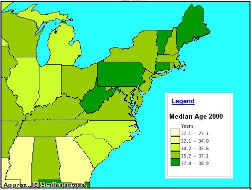
Classed choropleth maps
Classed choropleth maps generally include a frequency histogram which is used to interpret the data being displayed. Classed choropleth maps use shading and color variation along with statistical data to represent the information. The statistical data that has been compiled along with the histogram are used in order to determine the color variation and shading. Usually darker areas are used to represent larger data sets and lighter ones are used to represent smaller data sets. This map is showing the median age as of 2000.
 Link: http://hjp10.blogspot.com/2010/12/classed-choropleth-map.html
Range graded proportional circle map
Range graded proportional circle map is similar to the variable circle map in that it uses different size circles to display changing sets o value. However in this map there is usually only one set of data being displayed and as in the variable circle map the larger the circle the larger the data set. These maps are particularly good because they let the cartographer use variance in the symbol size so captures more than just the magnitude of the numbers. This range fraded circle map represents the population of europe.
 Link: http://www.d.umn.edu/geog/cartfolder/HTML%20Pages/Prop-Symbol2.htm

Continuously variable proportional circle map
A Continuously Variable Proportional Circle map is one in which circles of varying size and color are used to represent specific sets of data. Generally the larger sets of data will be represented by larger circles and those e sets of data with smaller value will be indicated by smaller circles. Since the continuously variable proportional circle maps also have data that is represented by color within the circle the cartographer is able to use the circles to show more than just one specific set of data. For instance if you wanted t show minorities who work in a particular skill set this map would be most useful.

DOQQ map
A DOQQ map or digital orthophoto quarter quadrangle is a map in which is used to measure true distance because it has been geometrically corrected. This is a type of aerial photograph that is done in black and white. Unlike other aerial photographs which have not been orthorectified the scale in a DOQQ is uniform even though it has the same amount of distortion as other aerial photographs. This is a DOQQ of the Lake Travis flood plain.
 Link: http://www.utexas.edu/depts/grg/hudson/grg360g/EGIS/final_project/spring04_projects/web_justin_reynolds/Lake%20Travis.htm

DEM map
DEM or digital elevation model is a map that is used to represent the height of either a specific feature of area. These maps are particularly useful for terrain analysis since they completely for go all other aspects of the surrounding area. Models representing water flow, precision farming, and base mapping are just a few of the areas in which this type of mapping is helpful. Since these maps and models place more emphasis on the vertical as opposed to the horizontal it is a good tool to use for determining relief. This is a DEM of part of the ivory coast.
 Link: http://www.mapmart.com/Products/Digital-Elevation-Models/DEM/Digital-Elevation-Model-Ivory-coast.htm

DLG map
A DLG or didgital line graph is a topographic map which has been digitized. There are four main parts included when creating a DLG. They are: boundries, surface water, transportation and contours. These maps can be useful to city planners when creating new routes in or around and area.
 Link: http://geography.wr.usgs.gov/sfcreek/dlg.html

DRG map
DRG or digital raster graphic is a map that is a scanned imagine of topographic map. These are good for assessing the wholeness of data in combination with other mapping agencies. It can be over lain with other data in order to create a more complete source. This is a DGR map of Cartersville,GA.
 Link: http://gpsinformation.us/Maps/topo.html

Isopleths
Isopleths are lines drawn through areas of equal value. These lines can be used to correlations between objects being studied. If you noticed a steady and erosion of a particular rock on the east coast you could then use isopleths to draw the correlation between the sane rock and erosion on the west coast if it weer occurring at similar rates. This map shows concentarations of TCE trichlorolethlylene in a river in Kentucky.
 Link: http://www.stonelions.com/Dayhoit.htm

Isopach
Isopachs are lines drawn through points of equal thickness. These maps are especially useful for geologist when it comes to identifying sedimentation deposits over a given area. These maps are also used to measure events such as volcanic eruptions. When needing ti identify areas with the largest amount of ash fall. This isopach map map shows ash fall from an eruption in Chilie in 1991.
 Link: http://www.geo.mtu.edu/~ajdurant/hudson.htm

Isohyets
Isohyets are lines drawn through points of equal precipitation. Because different parts of the world experience their "rainy season" at different points in the year isohyets will occur at different point through out the year. Isoheyts are usually drawn in bands that are measured in mm.
 Link: http://www.springerimages.com/Images/Environment/1-10.1007_978-1-4020-3995-9_633-0
Isotachs
Isotachs are used on maps in order to connect points of equal wind speed. By locating the isotachs on a mpa you are able to accurately guage the wind speed. On istach maps thaere are usually varying colors as well which will indicate the wind gusts or wind strrength.
 Link: http://weatherfaqs.org.uk/book/export/html/190
Isobars
Isobars are a form of contour line that is used to connect points of equal atmospheric pressure. Many of us will recognize these from the weather forecast. the are generally used to depict areas of high in low pressure in order to relate weather systems.
 Link: http://pangea.tec.selu.edu/~cboylan/etec644/weather3.html

LIDAR
LIDAR or light detection and ranging, is a form of remote sensing. This imaging process is used to measure distance through light technology. It measures the light via a laser, and uses a set of GPS coordinates in order to produce an accurate picture of a particular area.
 Link: http://www.saic.com/geospatial/modeling/lidar-urban-modeling.html

Doppler radar
Doppler radar sound familiar to most of us because we hear it used so frequently on the weather stations. Doppler radar is a specialized radar that uses varying types of visual effects to show objects that are some distance away. Whether the object is currently or moving or at a standstill this radar is able to photograph it and then produce a picture with amazing clarity. We see this used most often in reference to weather systems.
 Link: http://4warnwxteam.com/2011/04/26/a-brief-explanation-of-how-doppler-radar-works/

Black and white aerial photo
Black and white aerial photos are also used to to help distinguish features on the surface. Unlike infrared photography this type of photography lacks any color. It relies on the shades of gray to help bring out the characteristics of the land or of an object. These types of photographs can be good for seperating cultural landscapes from natural ones.
 Link: http://www.ngs.noaa.gov/web/APOS2/image_tut.shtml
Infrared aerial photo
Infrared aerial photos are a good way to help distinguish land features based on temperature. These types of photographs document the change based on n objects temperature. A good way to utilize this is when you need to distinguish land from water. Since the land is generally warmer than the surrounding water there will be a noticeable change in color between the two. This shows a deep water channel off Sacramento, California.
 Link: http://www.aerialarchives.com/infrared.htm

Cartographic animations
Cartographic animations are designed as anotherw ay to depict change. The main purpose of a cartographic animation is to display either temporal or non-temporal. These animations can display change over time such as the path of a hurricamne. While non-temporal animations can show changes in data. This animation shows the path of hurricane Andrew in 1992.
 Link: http://maps.unomaha.edu/mp/Articles/CartographicAnimation.html

Statistical map
Statistical maps are used to map the quantity of a variable. they can be especially useful for displaying information such as rainfall or average temperatures. An example of a statistical map is a dot density map or choropleth map. This map displays odds for which a given city is likely to be hit by a hurricane.
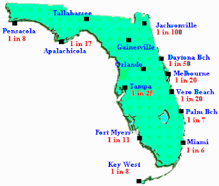 Link:http://noelgirl.blogspot.com/2010/12/statistical-map.html
Cartograms
Cartogarms are maps in which there is a substitution of variables, usually mapped thematically. For example if you wanted to show the relative size of U.S. capital cities based on their populations you can distort the size of the city to reflect its actual population. So that Tallahasseee would appear smaller than say Austin TX. Cartograms come in two classes. They are either area cartograms or distance cartograms. Distance cartagrams are used to show distances and time in between verticies.
 Link: http://haleysmaps.blogspot.com/2011/04/cartogram.html

Flow map
Flow maps are used to show the movement of objects. These objects can either be physical migrations of say people, animals, or weather. In which case the flow map might indicate something like say foreign migration into a particular country. Thesse maps can also show intangible flow as well. Thsese can be ideas, chain of command, or even just a flow map in which information is funnled downward from the top, such as in an office environment.
 Link: http://dguwfgis.blogspot.com/2011/03/flow-maps.html

Sunday, November 20, 2011
Isoline map
Isoline maps are used when there is a need to represent a three dimensional model in 2 dimensions. These maps have continual lines which link points of equal value. An example of this would be contour lines which we see on topo maps. These lines join at points of equal elevation. Isolines are also used to show wind speed in which case they are called isotachs, or to disply temperature in the form of isotherms. This map below is an example of isotherms since the isolines are relating to temperature.

Proportional circle map
Proportional circle maps are statistical maps in which there is a constant variable, such as the amount of corn produced by the U.S. in a given year. Formulas are used to control the area of the circles which will accurately reflect some attribute value. When creating proportional circle maps a vector graphics program is used. This map shows population in U.S. capitals.
 Link: http://sohosp.blogspot.com/2008_12_01_archive.html

Choropleth map
Choropleth maps are thematic maps that use a predetermined set of aerial units. These can be things such as states, counties, or even political boundaries. These maps are used when there is a need to show a statistical variable such as per capita income. Choropleth maps can be either classified or unclassified.
 Link: http://www.clearlyandsimply.com/clearly_and_simply/2009/06/choropleth-maps-with-excel.html
Dot distribution map
Dot distribution maps are maps that are used to record the occurrence of a particular phenomenon. They mark the spot of the occurrence by using a varying distribution of dots depending on the frequency of the event. They can be used to determine the relative frequency of unique phenomenon in a particular area, or can be used for tasks as simple as recording the income distribution of a city or state. This map uses dot distribution to show the frequency of AIDS cases in the U.S.
 Link: http://cdepart.blogspot.com/2011/02/dot-distribution-map.html
Propaganda map
Propaganda maps are exactly what the name implies. When putting together a propaganda map the cartographer can distort or exaggerate certain geographical and political areas to give the reader a distorted view of the concept. A big proponent of propaganda maps were the Nazis during WW2, in which they would make Germany appear larger and more expansive in comparison with surrounding countries in order to give the appearance that Germanys physical borders were much larger and further reaching than perhaps its actual political sphere of influence.
 Link: http://english.turkcebilgi.com/Nazi+Germany
Hypsometric Map
Hypsometric maps are used to distinguish elevation between different areas using varying shades of color to depict the relief. By enhancing the different zones of elevation it can give the treader a clearer understanding of the actual relief of a given place. By using contrasting colors to represent the greatest points of relief a reader can quantify the elevation changes more accurately. This map depicts different elevations on Mars.
 Link: http://www.csulb.edu/depts/geography/mars/
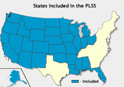
PLSS map
A PLSS map or (public land survey system) is a system of mapping the land in the United States by dividing it up into rectangular blocks. The U.S. Department of the interior and the Bureau of Land Management first designed this system as why to divide up federally owned lands. This map is a basic PLSS map and shows a fundamental PLSS map.This PLSS map shows the states included in the PLSS.
Cadastral map
Cadastral maps are used to accurately list the boundaries of countries,counties, or even just local land parcels. They are used to accurately record metes-and-bounds. By using GPS coordinates cadastral maps are able to show the precise location of a particular piece of land and its exact dimensions. This particular cadastral map shows parcels of land in St.Louis circa 1870.
 Link: http://mappery.com/St-Louis-1870-Cadastral-Map

Thematic map

Thematic maps are designed to show spatial patterns of a particular occurrence, whether it be natural or man made relationships. They are used to show a theme and are especially useful when correlating sets of data. This map shows population change in Canada.
Link: http://geodepot.statcan.ca/diss/maps/thematicmaps/pop_dist_e.cfm
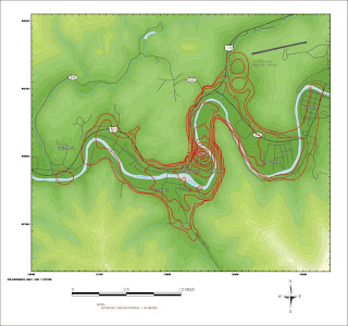
Topographic map
A topographic map is similar to a plainametric map in that it shows horizontal features, but a topographic map also gives more detailed information such as elevation. I have picked this topo map as an example because of how clearly it expresses elevation. You can see the hills in this map where the contour lines come together indicating an increase in elevation.


Planimetric map
A planimetric map is one that shows only the horizontal characteristics of place. It fails to capture the vertical features, or elevation. This map shows an area of California in which they are studying sedimentation rates and build up.
 Link: http://rls05g.blogspot.com/2008/12/planimetric-map.html
Mental Map
Link: http://blog.iqmatrix.com/mind-map/self-sabotage-patterns-mind-map
 A mental map is a map in which the personal projections of a persons mind are conveyed. This can demonstrate fundamental knowledge of a person neighborhood, in which accurate street maps are drawn or it can a map of say an idea, in which case there is not outline for that map except the individuals unique perception.

Subscribe to:
Posts (Atom)