Monday, November 21, 2011
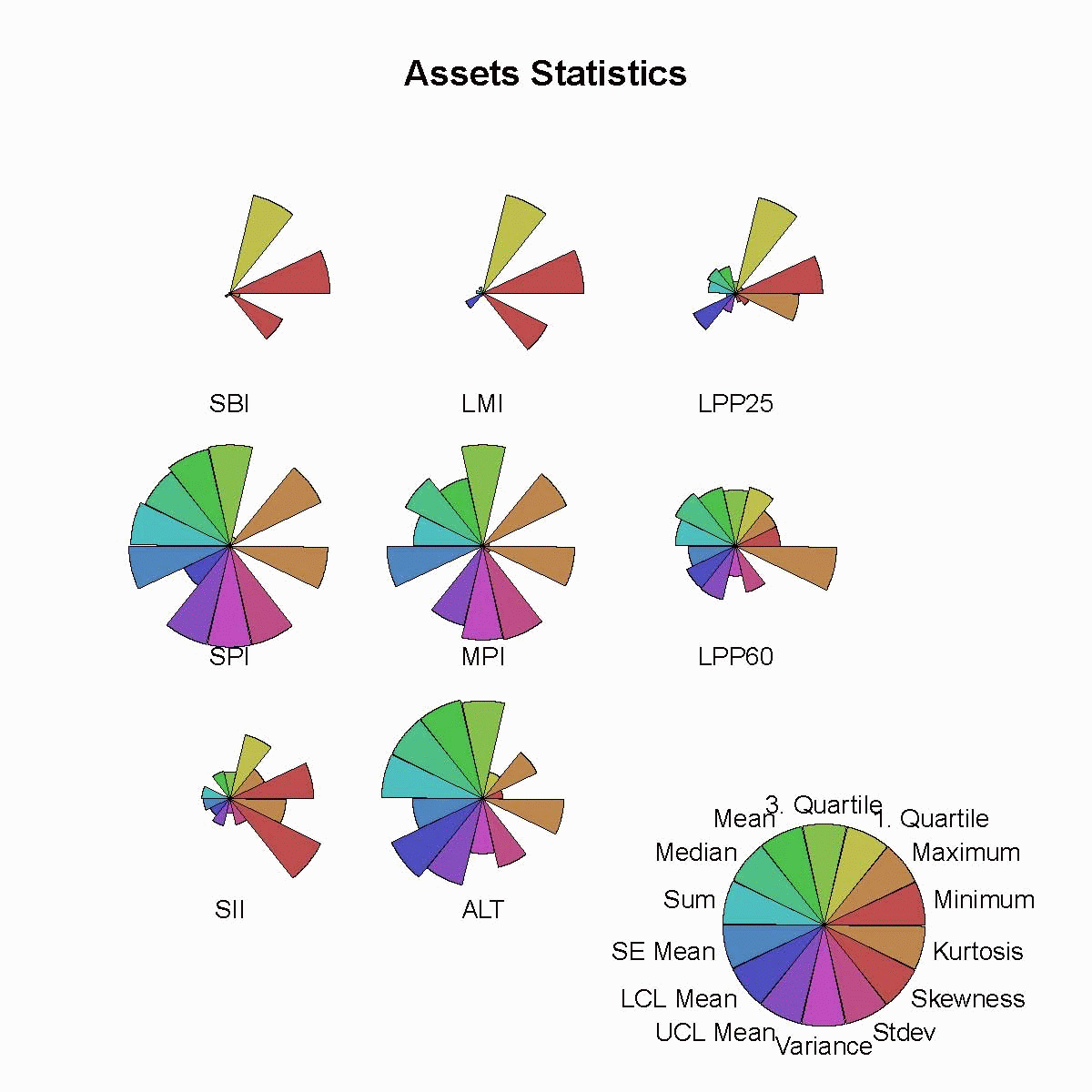
Star Plots
Star plots are an extremely useful way to display multiple observations observations with an arbitrary number of variables. Each observation is represented as a star-shaped figure with one ray for each variable. For each observation the length of each ray is made proportional to the size of its corresponding variable. With star plots variables are used to construct the plotted star figure. The data or star-shaped figures are usually arranged in a rectangular formation.
 Link: https://www.rmetrics.org/node/35
Stem and leaf plot
The stem and leaf plot is used to represent statistical data in two columns. The numbers on the left represent the the stem and the numbers on the right are the leaves. This plot represents quantitative data in a graphical format. These quickly relate the range and distribution of the data to the reader. The stem is representative of the ones place while the leaf represents the rest of the number.
 Link: http://psych.rice.edu/notestat/chapter2/stem.html
Box plot
Box plots are used to display a 5 number data summary. The upper limits of the box contain the 75th percentile while the lower limits of the box contain the 25th percentile. The middle of the box contains the 50th percentile. With in the box plot is the median, the upper and lower quartiles and the minimum and maximum data values. The line in the middle of the box shows the median values while the outer lines show the minimum and maximum values.
 Link: http://dominiquegrant.blogspot.com/2009/01/box-plot.html

Histogram
A histogram is used in a way so that we can visually display the distribution of a set of statistical data. It involves a continuous variable and and is an estimate of its probability of distribution. The histogram below was created in order to show immigration to the U.S. from Northern Europe.
 Link: http://gnuplot.sourceforge.net/demo/histograms.html

Parallel coordinate graph
Parallel coordinate graphs display data with more than 2 dimensions. Each attribute is displayed as a vertical line, ranging from the lowest value of that attribute to the highest. It makes it much easier and faster when doing comparisons for each of the sets of data. The parallel coordinate graph below shows various relationships relating to car engines and the amount of cylinders in them.
 Link: http://hci.stanford.edu/jheer/files/zoo/

Triangular plot
Triangular plots are used to show the sum of the parts of three variables. The data is represented in an equilateral triangle in order to show the ratios of the three variable. This is used a lot in mineralogy when discussing solid solution series between two or more minerals. By placing them in the triangular plot we make clear the composition of the three components of the sum total.
 Link: http://perezmaps.blogspot.com/2011_03_01_archive.html

Windrose
A wind rose is used by meteorologist and climatologist to give a brief overview of how the wind speed and direction are related at a particular location. A polar coordinate system is used to monitor the frequency of winds over a long period of time. Different color bands are used to represent wind direction. The direction with the longest band is the primary wind direction.
 Link: http://www.maine.gov/dep/air/meteorology/Windrosehome.html

Subscribe to:
Comments (Atom)